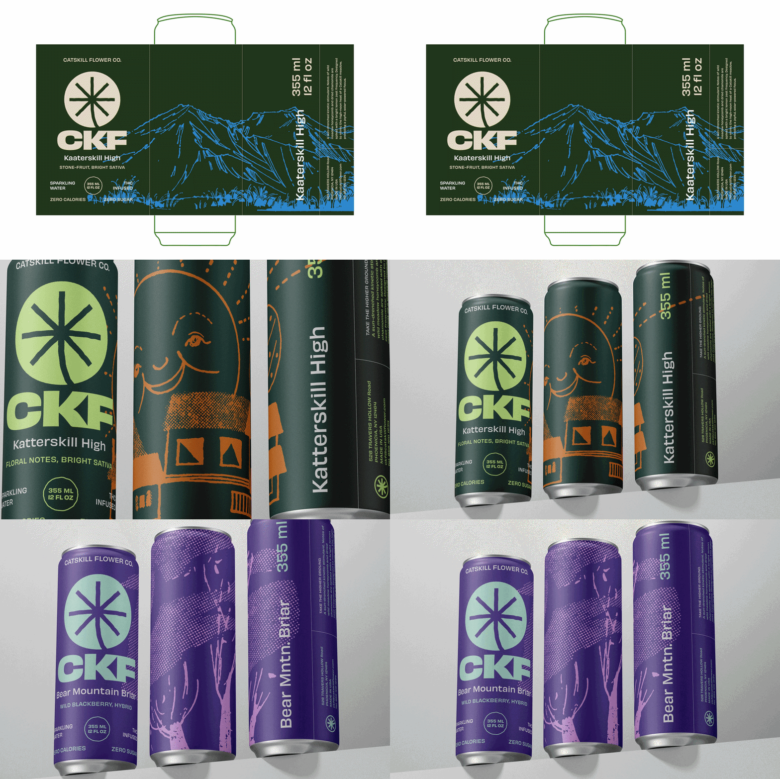
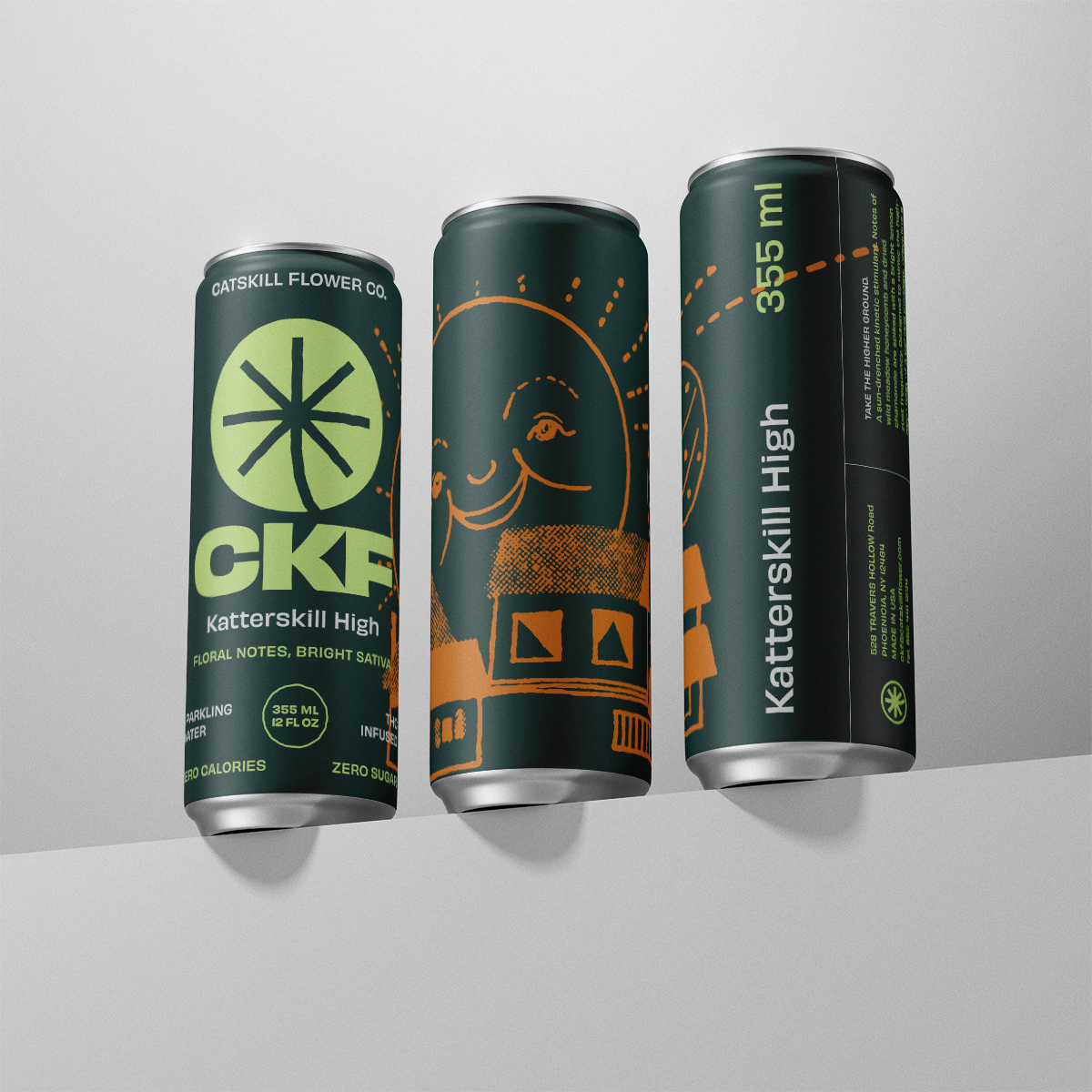
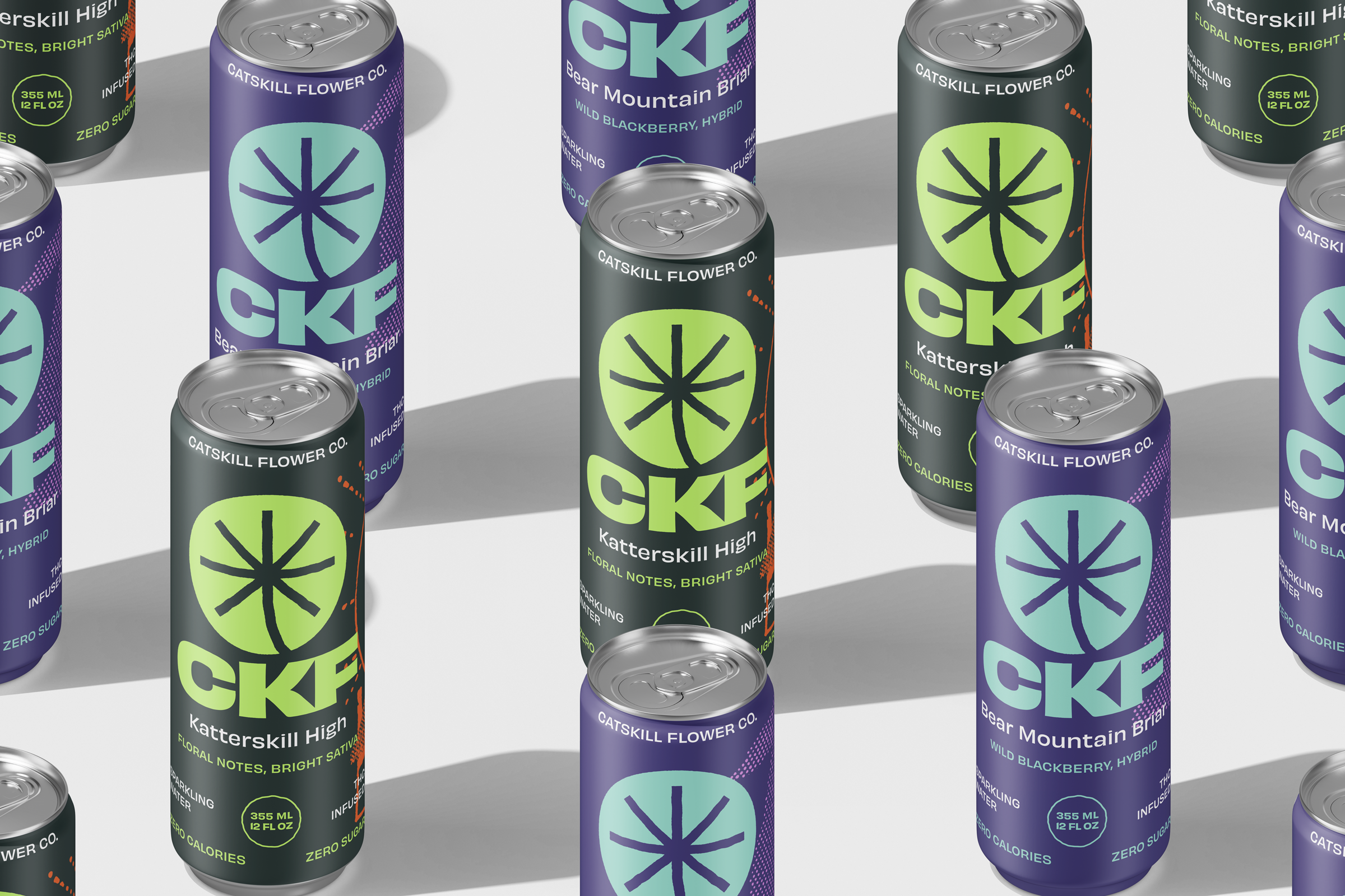
Catskill Flower Company
ART DIRECTION, DESIGN, BRAND ID, MOTION GRAPHICS
My task was to architect a visual system that honors the region while positioning cannabis as an approachable product in the cannabis space. I created a brand that doesn't just sell a product—it guides a ritual.

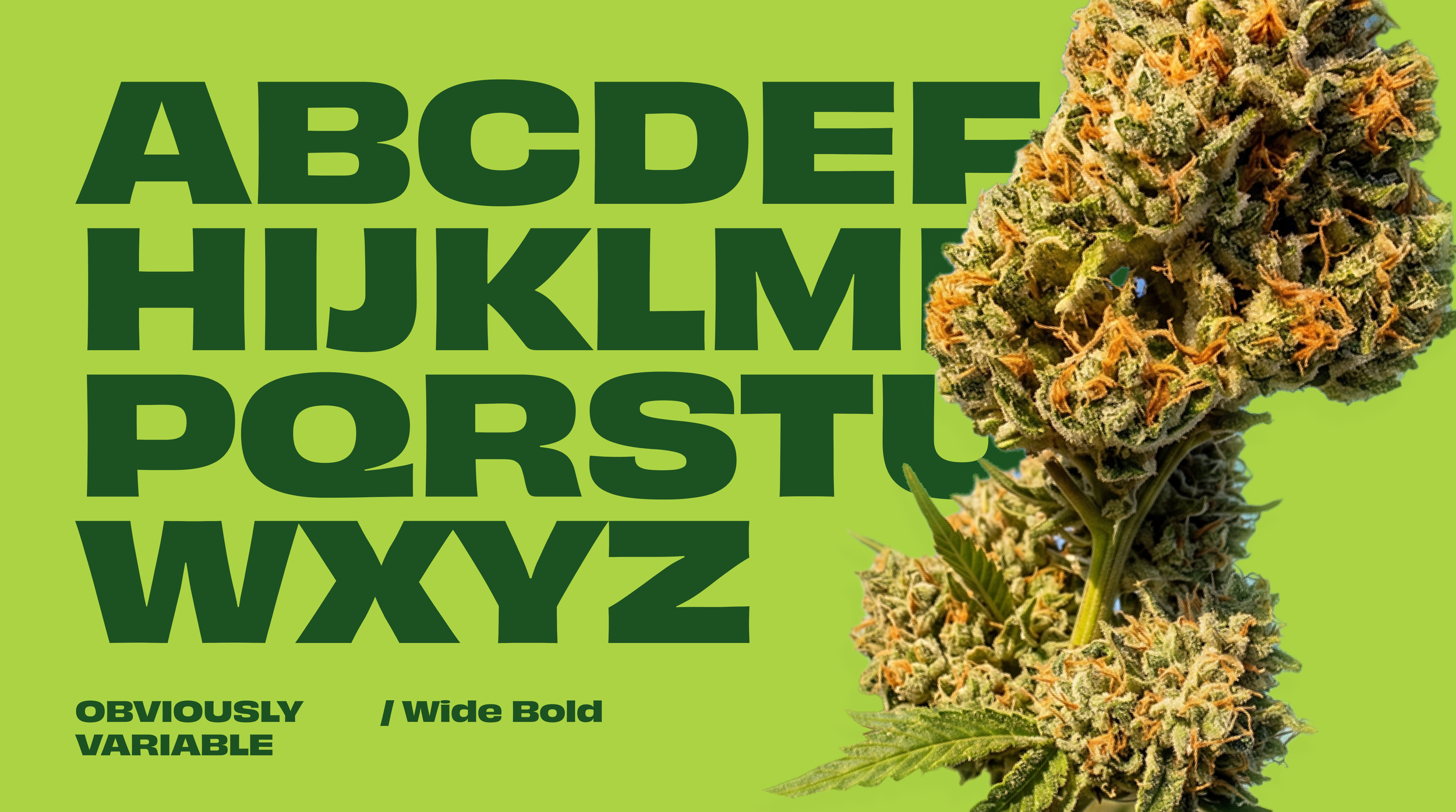
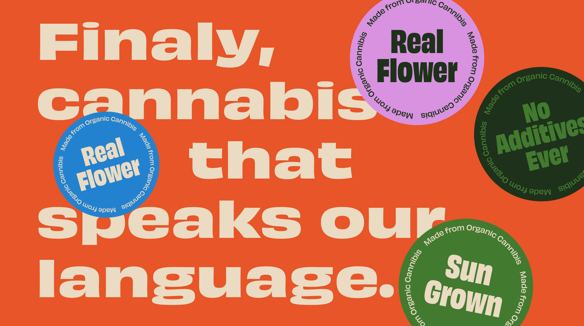
Motion as a functional tool
Simplicity, functionality, and minimalism were the pillars for this series of motion graphics IDs. To remain consistent and scale across various screens, I prioritized a clean, digital feel. The identity is alive, reflecting its regional origin and the simple truth that a connection to nature should be vibrant. But for a brand to feel "alive," we had to define its behavior.
Retail environment on-screen displays
Our in-store motion graphics are a fun nod to our roots, full of the lively, vibrant energy you get from a great day in the Catskills. A functional, un-confused space that explains our journey.