
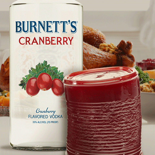
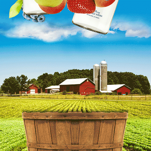
Burnett’s Flavored Vodka
ART DIRECTION, DESIGN, MOTION GRAPHICS
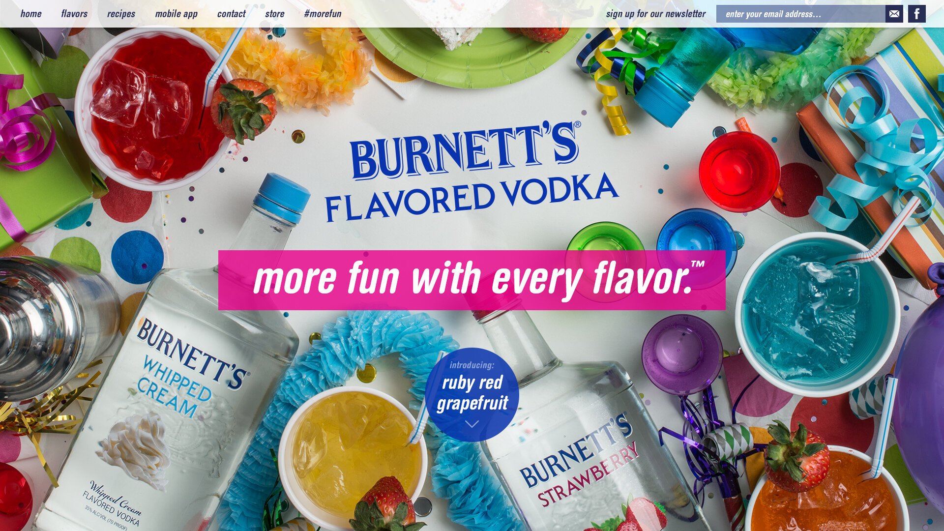
Burnett’s Vodka has long been a staple of the spirits aisle known for its versatility, vast flavor profile, and accessible price point. The challenge: refresh the brand’s visual identity to resonate with a modern, design-conscious audience without losing its high-energy, inclusive spirit.
-
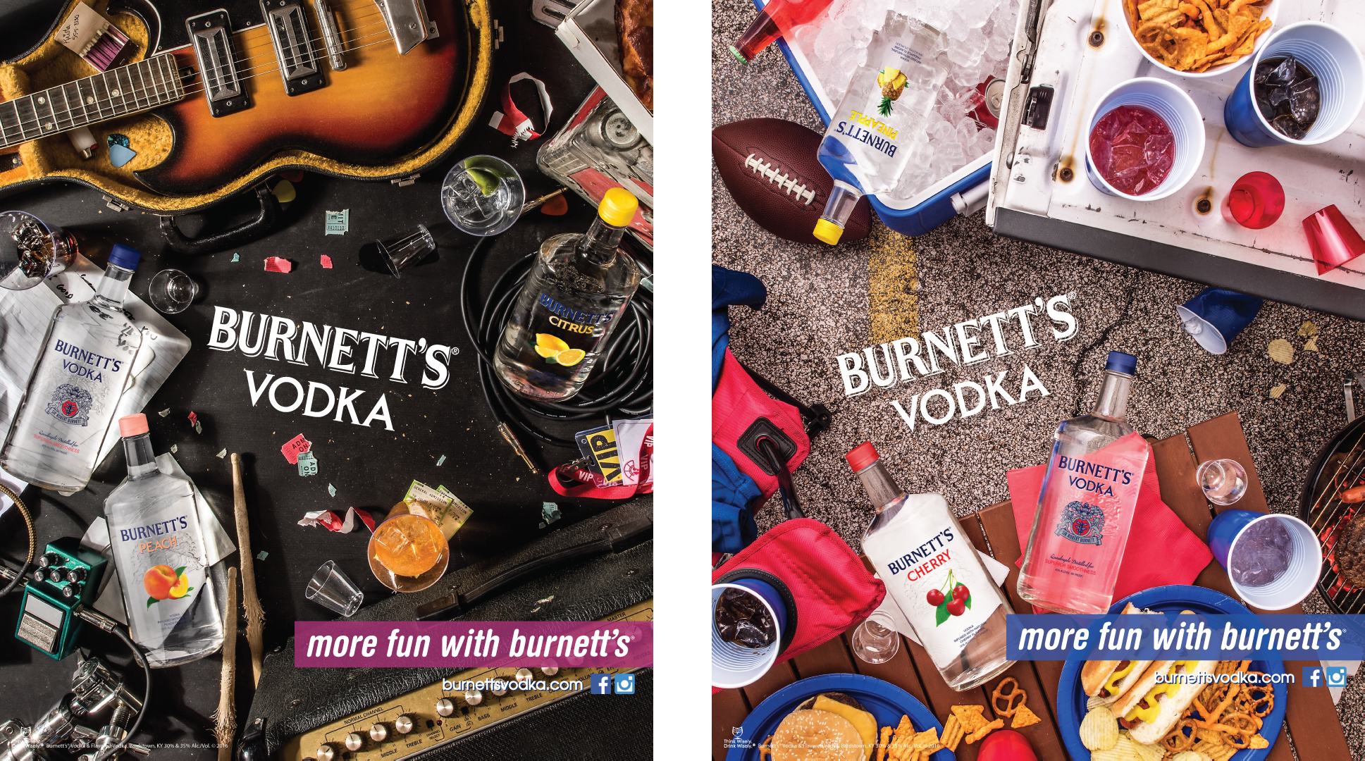
To elevate Burnett’s, we moved away from generic "party" tropes and toward a dynamic, flavor-forward visual language. We focused on the "sensory explosion" of their 30+ flavors, using bold typography and high-contrast color palettes to make the brand pop in a crowded digital landscape. The goal was to transform Burnett’s from a "budget choice" into a "lifestyle brand" that celebrates creativity and self-expression.
-
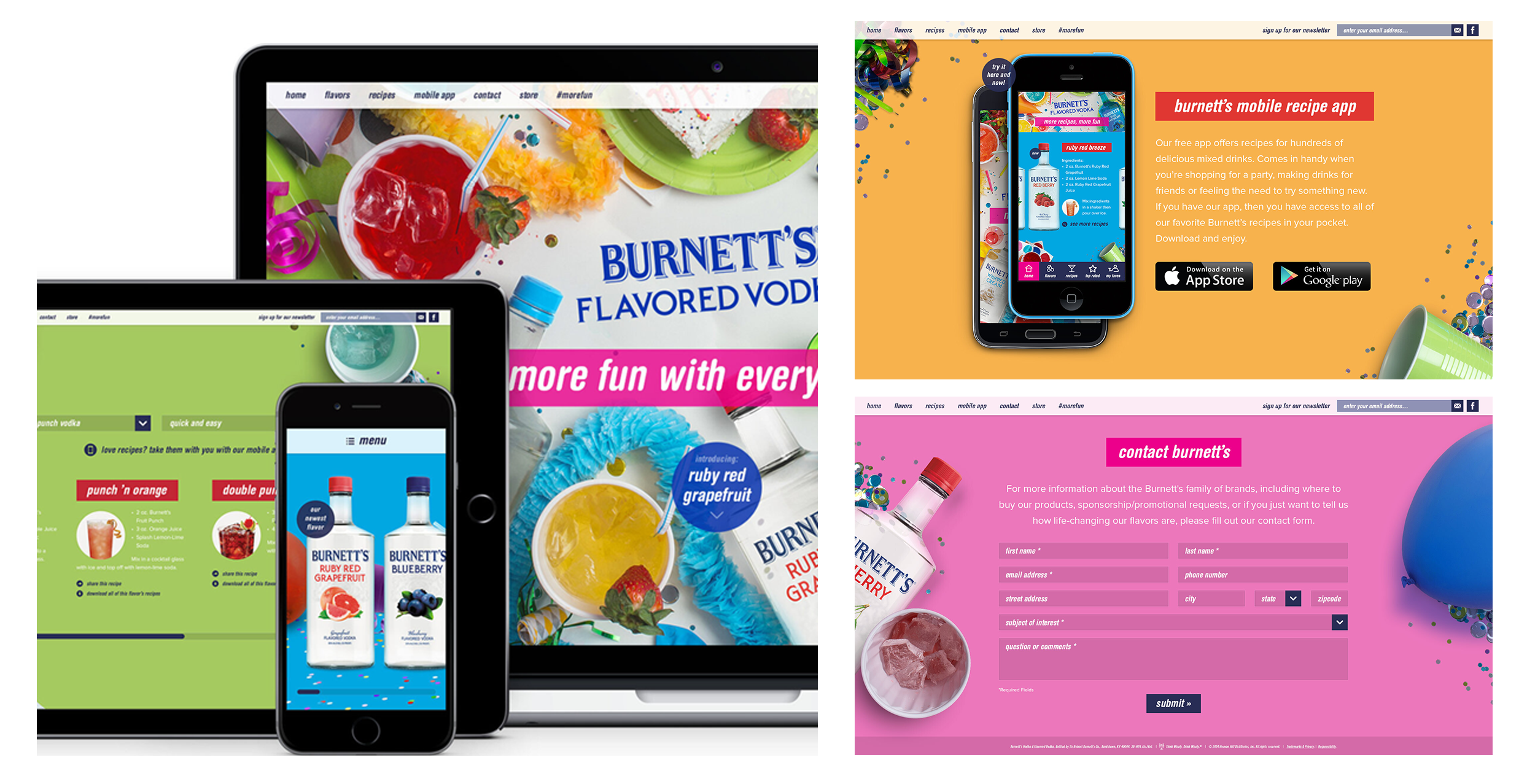
The revitalization was anchored by a series of high-octane motion graphics and a streamlined digital interface.
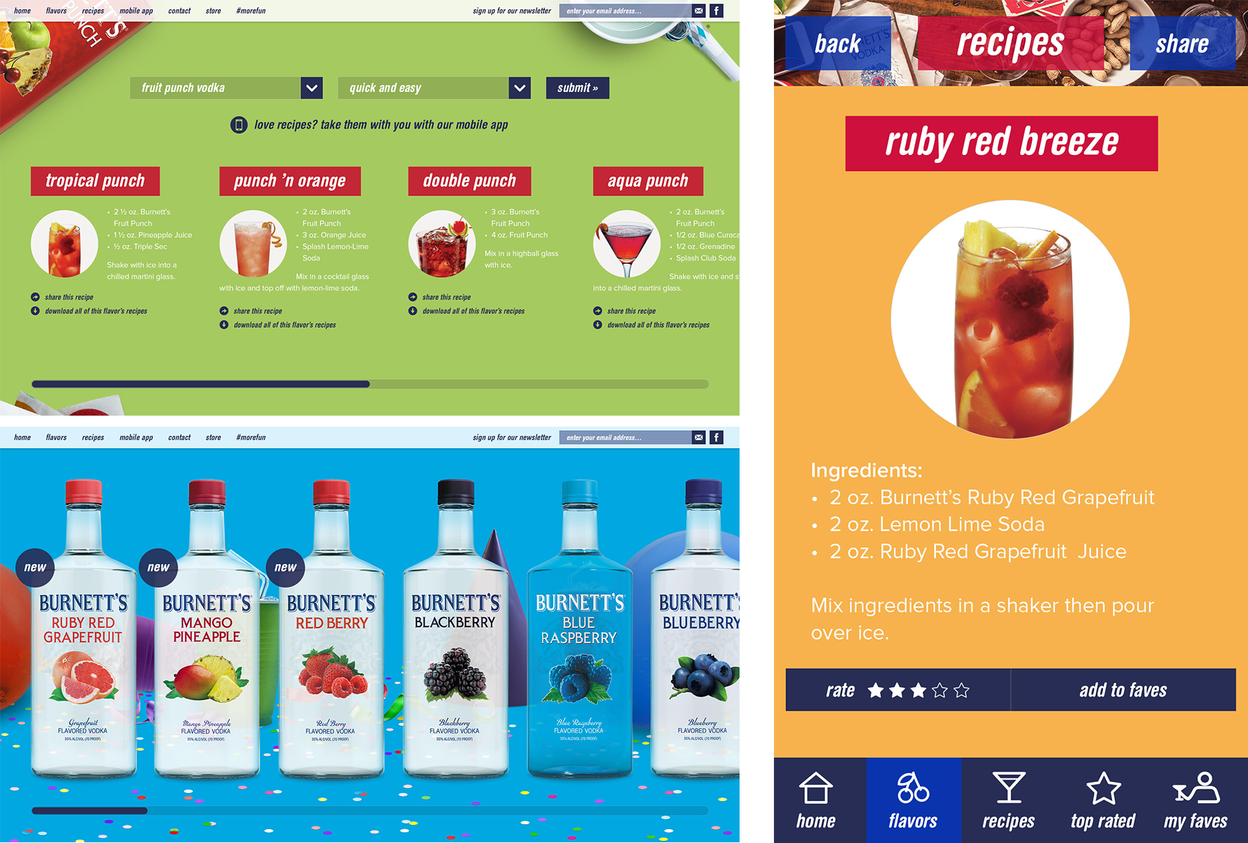
Visual System: Developed a modular design system where each flavor has its own distinct color story, unified by a sleek, modern typeface.
Motion Graphics: Created rhythmic, looped social assets that emphasize the "mixability" of the product—using liquid simulations and fast-paced editing to drive engagement.
Web Design: Reimagined the user journey to prioritize flavor discovery, incorporating an interactive "Mixology Finder" that helps users find the perfect cocktail based on their mood.
-
The brand refresh led to a significant shift in digital sentiment and retail presence. By focusing on quality design over quantity messaging, we saw a 40% increase in social media engagement and a measurable uptick in brand favorability among the Gen Z and Millennial demographics.


Collaborators
Agency: Method 1
CD: Shaun Samson
ACD: Judd Cherry
Retoucher: Ryan Downie