
Lunazula Tequila
ART DIRECTION, DESIGN, MOTION GRAPHICS
Stand out in a tequila market crowded with celebrity names and flashy packaging, while staying true to Lunazul’s promise of premium without pretense.
-
Build a brand world around the moon—Look to Luna—linking heritage and authenticity to a symbol of guidance and discovery. Speak to savvy drinkers who value real quality over excess.
-
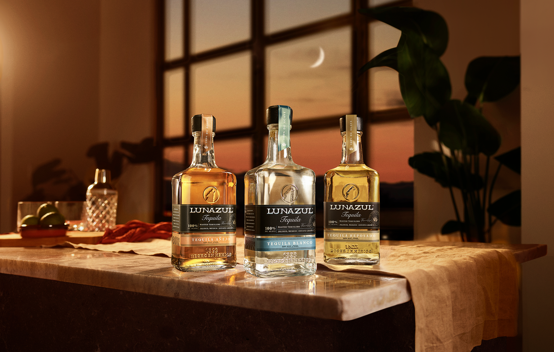
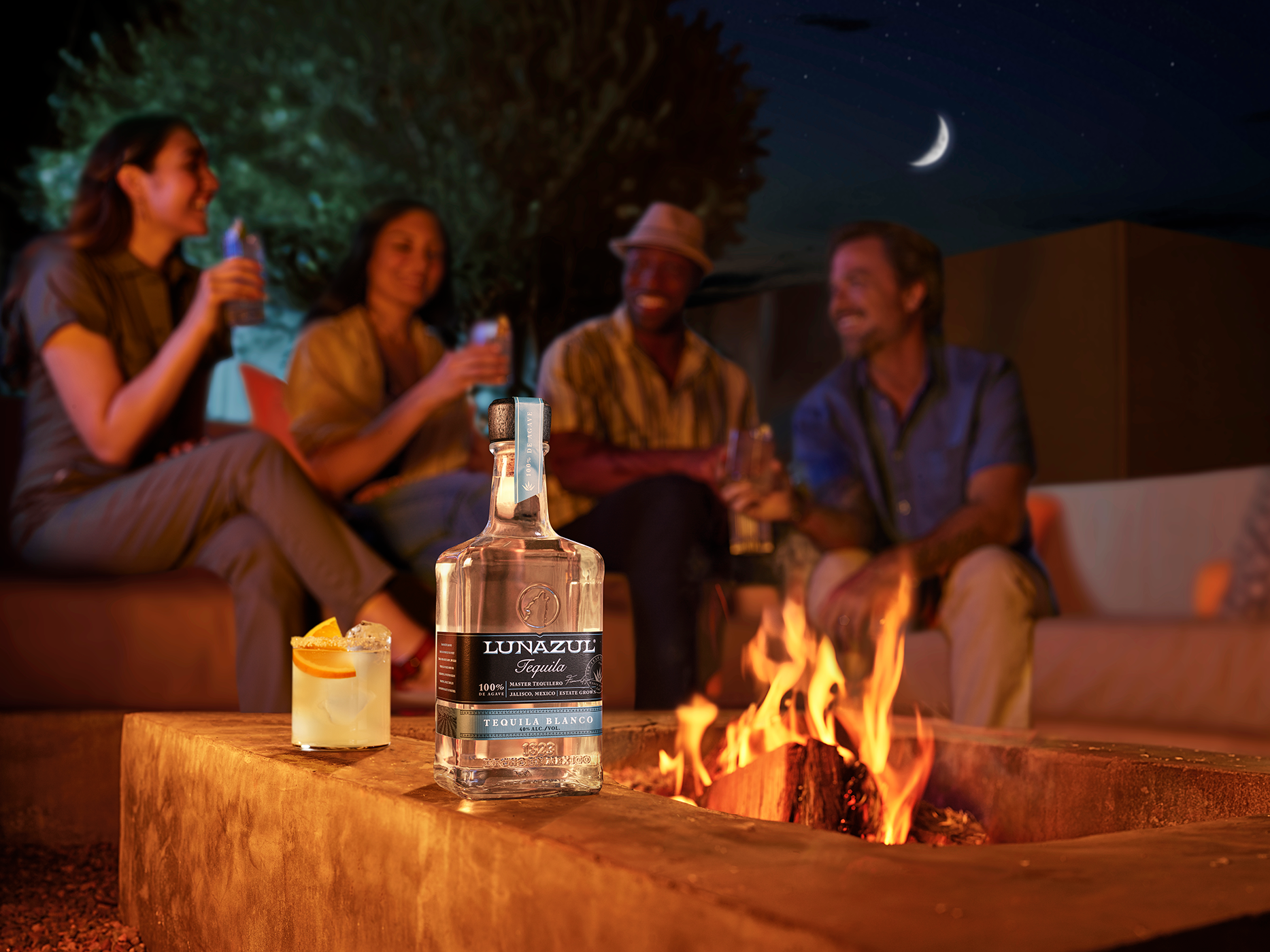
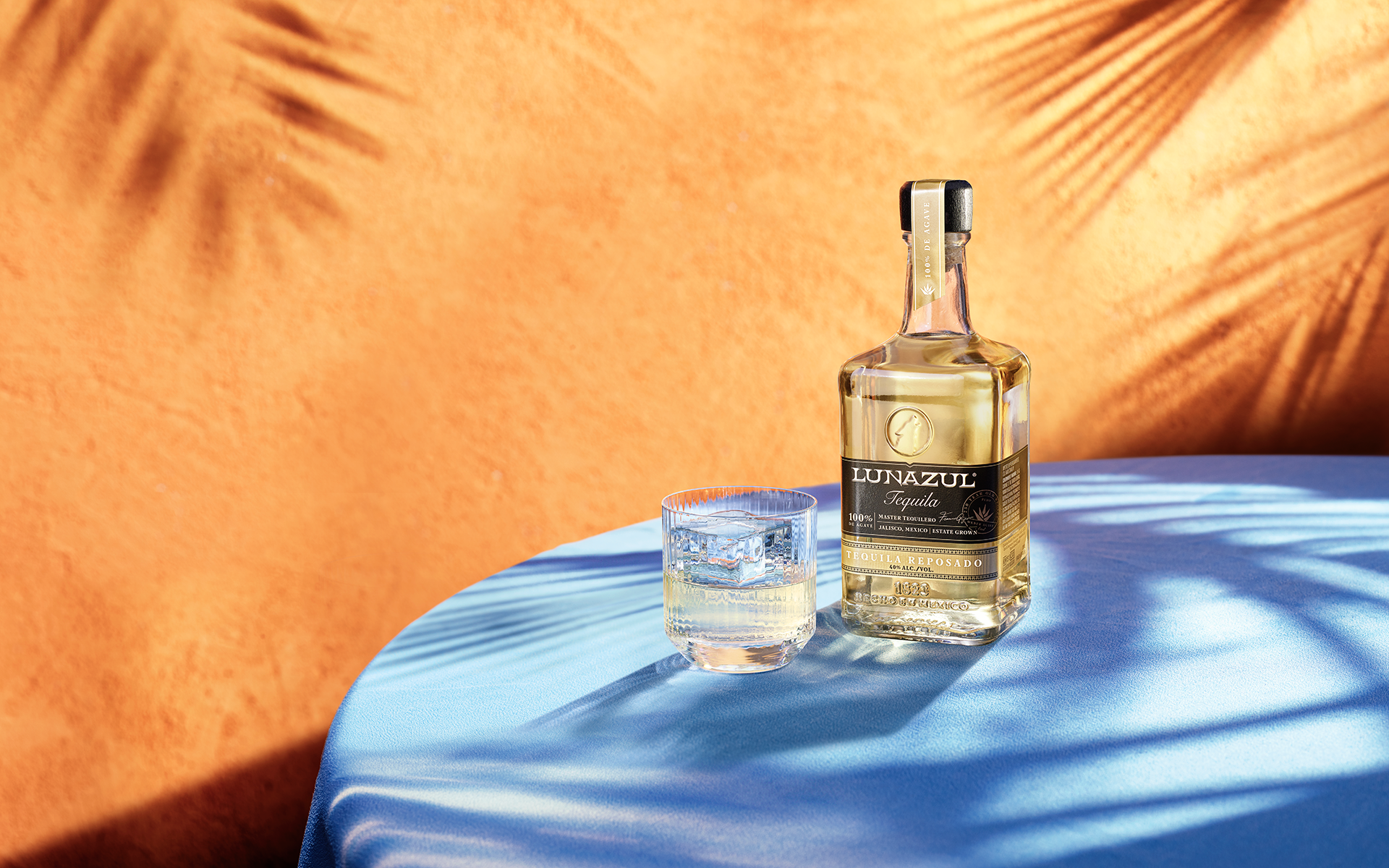
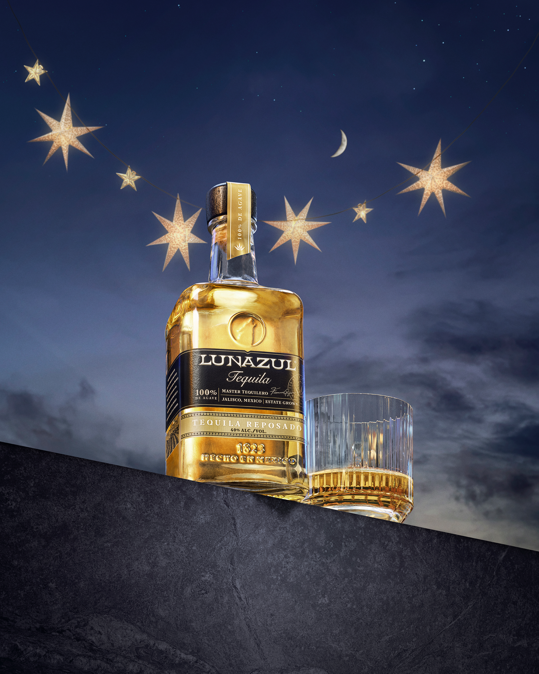
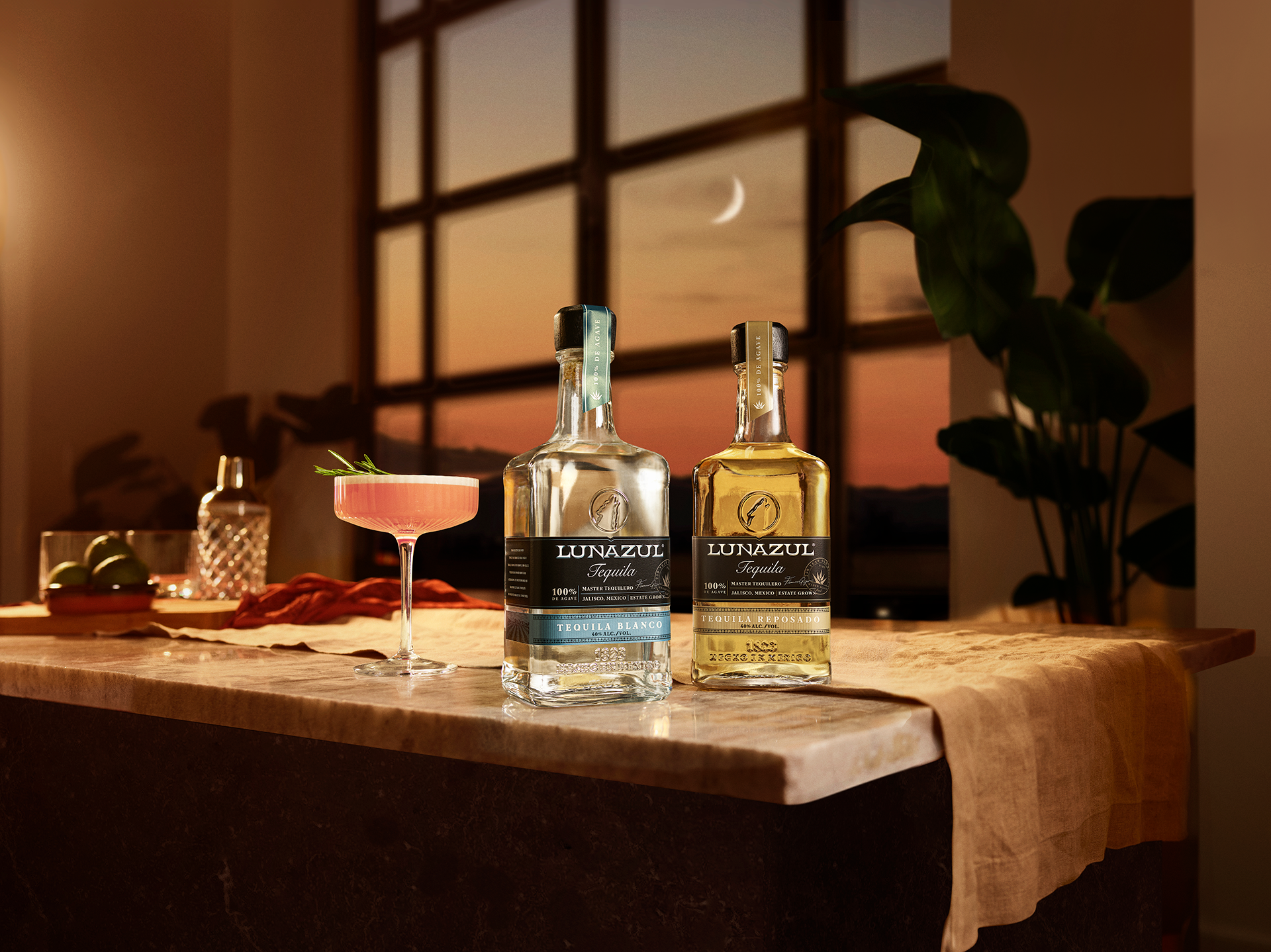
A two-day shoot delivered a 3–5 year evergreen library of bottle, cocktail, and lifestyle assets. Hero shots featured moonlit bottles, twilight gatherings, and authentic at-home occasions, rolled out across digital, retail, and social.
-
The campaign boosted brand visibility with a 60%+ share of voice on branded terms, drove double-digit lifts in engagement and followers, and increased website interaction by 25%. Look to Luna firmly positioned Lunazul as the in-the-know choice for quality tequila without the flash.
We built Lunazul’s distinctiveness by designing a visual system of moon-glow light, confident typography, and restrained palettes that made the brand instantly recognizable in a crowded tequila market. We transformed Lunazul’s authenticity into an advantage—creating a brand presence that stood out with clarity and confidence in a category defined by noise.


I developed a unified brand guide that codified Lunazul’s visual and verbal identity, enabling seamless alignment across in-house teams and external vendors, while ensuring every touchpoint reinforced the campaign’s distinctiveness.

We made the deliberate choice not to chase the noise of celebrity-backed competitors but instead to root the brand in its authentic promise: “premium without pretense.” This decision set the tone for the entire campaign—elevating honesty and restraint as a differentiator in a crowded market that thrived on spectacle.
I elevated the moon, a latent element already embedded in Lunazul’s name, into a hero distinctive brand asset. This wasn’t just a visual flourish—it became the guiding symbol for the entire identity system and positioned the moon as a rallying symbol of distinctiveness in the category.


I directed the design of the Lunazul website as the brand’s digital home, translating “premium without pretense” into a bold, modern experience. By defining typography, color, imagery, and motion, we created a seamless system that extended the campaign online and made Lunazul instantly recognizable across digital touchpoints.
In addition to promotional videos around influencer gatherings, we boosted social engagement by bringing still photography to life with parallax and compositing. This lean approach delivered motion-driven assets at scale, letting us vary content across channels without sacrificing engagement.


Collaborators
Agency: Method 1
Photographer / Video Director: Rob Lawson
Executive Producer: Dana Discordia (Gin & Burger)
Producer: Ian Carlsen / Jack Hall